Start with the nearest preset, then refine the shade
Start with the nearest preset, then fix the shade. That gives you the right color family quickly and leaves time to compare the large preview with the reference. The broader picker matters when both players have already recognized the same basic hue.
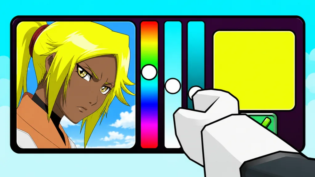
The observed interface contains a large current-color preview, a vertical color control with a movable indicator, eight visible preset swatches, and a submit button. Answers can go beyond those eight swatches, so do not treat them as the only valid choices. Think of them as anchors placed around a much wider range.
Understand the three decisions inside one color
A close match takes more than choosing “red” or “blue.” Split the color into hue, saturation, and brightness. You can make a better choice with a simple visual comparison, even though the game keeps its scoring math hidden.
| Property | What it controls | What a mismatch looks like |
|---|---|---|
| Hue | The basic color family and its warm/cool direction | Your answer reads orange while the target reads red, or cyan while the target reads blue |
| Saturation | How vivid or gray the color feels | Your answer looks neon beside a dusty target, or washed out beside a bold target |
| Brightness | How light or dark the shade appears | The family is right, but your answer looks pale beside a deep reference |
Correct hue first. Saturation and brightness cannot rescue the wrong color family. Once the hue looks right, adjust one remaining property at a time so you can tell whether the move helped.
Use the preset swatches as anchors
Eight visible presets cover neutral and common colors. Pick one when it is clearly closer to the target than your current preview. A good anchor saves a large picker movement and leaves more of the countdown for comparison.
A preset is enough when the target is broad and obvious. Keep adjusting when the reference looks lighter, darker, warmer, cooler, or more muted. The percentage screen can separate shades that both look “blue” in ordinary language.
Do not click every swatch to audition it. First name the family from the image, then choose the one nearest that family. Random swatch cycling spends time without improving your visual judgment.
Follow a compare-adjust-submit loop
Use the same loop every round:
- Locate the target feature. Decide which area of the displayed character you are matching.
- Choose the nearest anchor. Select the closest visible preset or move toward the broad hue.
- Compare hue. Check whether the preview leans too warm or too cool.
- Compare brightness. Decide whether the preview is too light or too dark.
- Compare saturation. Decide whether the preview is too vivid or too gray.
- Make one small correction. Change the clearest mismatch rather than moving everything.
- Submit with a buffer. Press the button and verify the submitted state.
A September 2026 match began with about 30 seconds on the clock. Use that as a pace guide and read the current timer every round. Choose an anchor early, compare it carefully, and settle on the final color with time left to submit.
Diagnose common visual errors
| Result on screen | Most useful next correction | What not to do |
|---|---|---|
| Right family, answer too pale | Lower brightness while holding hue steady | Jump to a darker but unrelated hue |
| Right family, answer too dark | Raise brightness in a controlled step | Push saturation to maximum |
| Correct brightness, answer looks gray | Increase saturation slightly | Change hue before checking intensity |
| Correct brightness, answer looks neon | Reduce saturation | Add black until the color looks muddy |
| Red target, answer looks orange | Shift hue cooler toward red | Darken orange and assume it becomes red |
| Blue target, answer looks cyan | Shift away from green toward blue | Lower brightness without fixing hue |
| Preview keeps getting worse | Return to the nearest preset anchor | Continue random movement across the picker |
The game does not publish an RGB, HSV, or perceptual-distance formula. You do not need one for these corrections because each starts with a difference you can see.
Compare the preview and reference efficiently
Do not stare at either image for too long. Switch your focus between target and preview. The difference in warmth or brightness is often easier to catch that way.
Judge the broad fill areas rather than outlines, highlights, and shadows. A portrait can contain pure white shine and near-black line art while its base hair color sits in the middle. If you average every pixel mentally, the result often becomes duller or darker than the intended feature.
When a shade is difficult, compare pale targets with white, dark targets with black, and muted targets with gray. These neutral landmarks reveal whether a colored tint is still present without pulling you into another hue family.
Know when precision matters
After the round resolves, both answers receive percentages against the reference. The distance formula and rounding are not public. What you can see is enough: a closer shade can decide a tight round even when both players chose the same basic family.
Precision matters most when the target sits between common presets, when it is unusually pale or dark, or when both answers are already in the correct family. It matters less than timely submission when you are still deciding between completely different hues. Secure the big decision before polishing the small one.
The game has a 100% Accuracy badge, but it does not hand you a universal picker coordinate or answer table. Match the current reference instead of chasing a position you remember from another prompt.
Manage the countdown without panic
Time pressure causes two common mistakes. Some players submit the first rough hue; others keep adjusting until the clock disappears. Use the live countdown as your checkpoint instead of following a rigid script.
At the start, identify the feature and hue. Around the middle, settle brightness and saturation. Near the end, stop exploring and submit the best stable choice. If your client shows a different starting time than the roughly 30-second observed round, keep the same three phases and scale them to the timer on screen.
Once submitted, the button changes state in the observed interface. Check that confirmation and leave the picker alone while the opponent finishes. Repeated clicking does not improve a locked shade.
Practice the picker with useful goals
Wins are a poor practice metric on their own. A duel includes several prompts and a visible heart display, while the game does not explain every heart change. Use percentages to set narrower goals:
- Reduce obvious wrong-family answers.
- Turn correct-family misses into closer brightness matches.
- Recognize muted shades before choosing a vivid preset.
- Submit consistently with time remaining.
- Remember which single correction improved a repeated visual category.
This still works when the prompt pool changes. The experience advertises more than 100 characters, so good picker control beats memorizing a few fixed coordinates.
A final picker checklist
Before locking your answer, ask:
- Did I identify the exact feature I am matching?
- Is the hue family correct?
- Does the target lean warmer or cooler than my preview?
- Is my preview too light or too dark?
- Is it too vivid or too muted?
- Did I make one purposeful correction instead of several random ones?
- Does the current timer leave enough time to submit?
- Did the button visibly enter its submitted state?
If time is short, prioritize the first, second, seventh, and eighth checks. A stable correct-family answer that is submitted is better than an unfinished perfect shade.
FAQ
How many preset colors are visible in Guess the Anime Color?
The observed interface shows eight preset swatches. The broader color control supports choices beyond those presets, so check the current client if the layout changes.
Should I always use the precise color control?
No. Start with a preset when it gives you a fast, close anchor. Refine only when the reference clearly differs in hue direction, brightness, or saturation.
Does the game score colors with RGB or HSV distance?
The exact scoring model and rounding method are not public. Use hue, brightness, and saturation as practical visual controls rather than claiming an official formula.
Why did two similar colors receive different percentages?
Two shades can share a broad color name while differing in warmth, brightness, or saturation. Compare those properties individually on your next similar prompt.
How much time should I leave to submit?
Use the live countdown and stop refining with a small buffer. One observed timer began around 30 seconds, but you should verify the current round rather than depend on a fixed duration.